
Main Task Research and Planning
First of all detail what the recognised codes and conventions of a music magazine are:
- Genre specific content
- Clear and recognisable 'house style' evident through magazine
- Clear masthead
- Varying font size
- Qualifier or strapline to convey ideology of the magazine
- Convergent links (facebook, twitter etc.)
- Barcode
- Issue number, date and price
- Pug
- Anchorage text
- Splash - main coverline
- Coverlines
- Linguistic devices - use of declaratives! Rhetorical questions? Puns, Alliteration, use of onomatopoeia, contractions, ellipsis, personal pronouns
- Non verbal communication
- Box outs
- Pull quotes
- Byline
- Editorials
- Double page spread - image bleeds over page
- Direct and indirect advertising
- Text boxes - other relevant information not directly linked to main story
Then, detail your research of 3 Kerrang! front covers and contents pages and 2 non music magazine covers. Look at Conner's work below:
Analysis of two different genres of magazines
Here is my analysis of magazines of different genres to that of school and music magazines. I decided to complete this analysis in order to see what the different codes and conventions are in varying genres of magazines. An example is that I now understand why Men's Health have chosen a sports star as the main image for the magazine, in order to attract sports and fitness fans in general and people who view them as icons. The reason I decided to analyse these two particular was because I was intrigued at how both of them looked attractive with their layout and design yet they were both very different in the way that one was full with text/information and the other wasn't. I was trying to identify whether I could try and implement any of the key codes and conventions found in these magazines into my own magazine creation.


Bauer and Institutions
In preparation for the construction of my music magazine and also for my exam sim Section B question, I decided to investigate the conglomerate that owns Kerrang!, Bauer media group. I researched many aspects of Bauer such as ownership, target audience, the impact of digitalisation, synergy and convergence. Below are my findings on Bauer Media and the impact that institutions such as them have on products and their distribution. It is essential for me to understand institutions and the digitalisation of media products in order for me to produce a realistic, marketable magazine for a modern day audience. It has also showed me the importance of having convergent links.


National readership figures

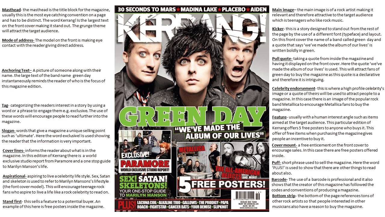
Here is my linguistic analysis of 3 Kerrang magazine front covers and contents pages. I needed to complete this analysis because Kerrang was my specific case study.

Next discuss your ideas for your production. Look at how Sam has detailed three options:
Music Genre and Name
Seeing as my original case study was Kerrang which is a rock and roll magazine, I decided to vary my specific genre and decided to base my magazine on mainstream music. Of course I would have preferred to concentrate on rock music, however, I thought that constant use of that specific genre would limit my creativity. Deciding on a recognisable and appropriate name for my magazine was very tough and I really had to delve deep and recall all of the different narrative techniques I have learnt during my AS Media studies lessons. After much consideration, I decided to call my magazine 'Mainstream Madness'.
Alternative Titles
Although I was pleased with my initial name for my magazine, I decided to come up with three more in order to give myself a wide field of options. Here are the three alternative titles I came up with whilst deciding upon a finalised name:
- P.O.P- POP ONLY PEOPLE
- MusicMania
- Your Pop Weekly
Possible Main Images
A key component of any magazine front cover is the main image. It is the first thing that the reader sees and plays a big part in the reader's decision about whether or not they are interested in purchasing the magazine. During this particular section of my main task I have researched and detailed four possible main images that I could use for my magazine. I feel that these images would be very appropriate and relevant as they are well composed, carefully created studio photographs of famous people. The striking object relates to the genre of the magazine and make my magazine instantly recognisable. They would be extremely relevant to my magazine target audience as they are all very significant people within the music world and in particular my genre of music. The subjects are instantly recognisable, they all have plain backgrounds so there would be a lot of room for my cover lines and other key features to go. These particular images also adhere to the rule of thirds; this is a big selling point because our eyes are naturally drawn to the sides of the image which is where my sell lines would fit in accurately. Here are the four images that I was contemplating using for my magazine.


To develop my planning, I came up with a list of possible sell lines to make my magazine link with my target audience effectively. Here are my sell line ideas:

After this planning, I finally made a mock-up front cover of my magazine with ideas based on my research. I designed this on PagePlus to help me develop my skills for my final music magazine front cover. Here is my mock up:

This next front cover is my alternate mock up front cover with a different name:


After this, I made a mock-up of the layout of my double page spread. Here is my mock up:

After this, I decided to carry out some market research on my target audience to find out what exactly would interest them in my magazine and to give me some more ideas on what to include. Here is my questionnaire:

No comments:
Post a Comment